Case Study
PCO Engineering
The Company
With more than 10 years of experience in the industry, PCO Engineering is a company that offers a range of office and home renovation services. But companies offering the same services are in the thousands, and they do not have a brand differentiation or a marketing strategy.
BRAND + MARKETING
BRAND
With a need to refresh the branding of the company, we assisted PCO Engineering to create a new brand identity and develop a new statement with a goal in mind.
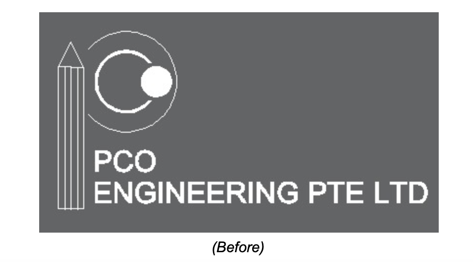


The three letters P, C, and O are integrated into the new PCO logo. The entire design is created in the clock’s position, which symbolises 10:10. It signifies perfection and emphasises the company’s commitment to completing all projects with passion and perseverance. Furthermore, the logo’s angle is slightly higher than 90 degrees, indicating the highest level of professionalism and devotion among PCO furniture makers.
Color Palette & Typography


PCO’s colour palette is a mix of natural and earthy tones that represent the breadth of the company’s operations in the construction and building sector. The palette expresses the brand’s maturity and dependability, which aids in identifying the company’s particular identity.
Furthermore, the colour palette’s brown tones help to represent what the company stands for. Darker shades of brown portray the brand as earthy, rich and lustful feels whilst lighter shades of brown will represent approachable and honesty.
The primary typography used is Century Gothic Bold, a geometric sans serif font designed to look modern and neat in depicting the company and work it performs.


MARKETING
The project includes developing various strategies and campaign ideas from online to offline.
✓ Identifying target audience
✓ Development of Marketing Strategies
✓ Development of Marketing Calendar, Budget and KPI
Brand & Marketing Collaterals


Result
Quality Zone Technology helped rebranded PCO with a fresh new look and online presence that helps to highlights PCO’s work, expertise and ability to deliver quality, reliable and value for money work. The new visual identity and brand guideline provides a consistent touch for the company across all its channels maintaining the brand message and tone of voice. It ensures its consumers will recognise the brand with a new distinct personality. We have created a matching business card design, letterhead and more.
Our work on PCO is ongoing, and it has been a lot of fun. We anticipate witnessing a rise in brand awareness and sales as we execute PCO’s digital marketing approach with the inclusion of campaigns.
If you’re ready to analyse where your company needs a new branding and marketing solution, request a meeting with one of our specialists now to start the conversation.